
Academy of Art
University CATALOG
In 2018 I was designated as the Lead Designer and Art Director for a complete re-design of the Academy of Art University Course Catalog.
Aiming for a complete update of the book and capitalizing on the opportunity to shoot facilities and students in a contemporary visual aesthetic, 70 on-site and in studio shoots were scheduled, resulting in an extensive index of new photography to use for the re-design.
Due to the number of schools housed under the University umbrella, the book design is housed in an .indb file. To streamline typesetting, GREP styles are used throughout the degree requirement and course description sections.
Footwear Design Tool Laydown Grid to the right: Art Direction, Kate Nakamura. Photography, Danielle Rueda.
Objective:
Create new design direction for Academy of Art University’s Course Catalog inspired by 180 Magazine (University publication - Issues 7-9 and current web presence designed by me through the School of Fashion).
Generate new index of images for all majors that follow new art direction.
Goals:
Successfully showcase new facilities and equipment that the University has invested in since the last updated catalog was created.
Elevate University optics, contributing to overall enrollment for all degrees.
Highlight focus on new and developing technologies, inter-departmental collaborations, and social equity.

Deliverables:
Printed catalog layout with finish size of 8.375” x 10.875” highlighting lay-flat binding in book design.
Digital PDFs exported from InDesign files to be posted online as curriculum and course reference for current and prospective students.
Index of new photography shot for the catalog.
On-location photoshoot with Academy of Art University Track Team: Art Direction, Kate Nakamura. Photography, Danielle Rueda
Moodboards:
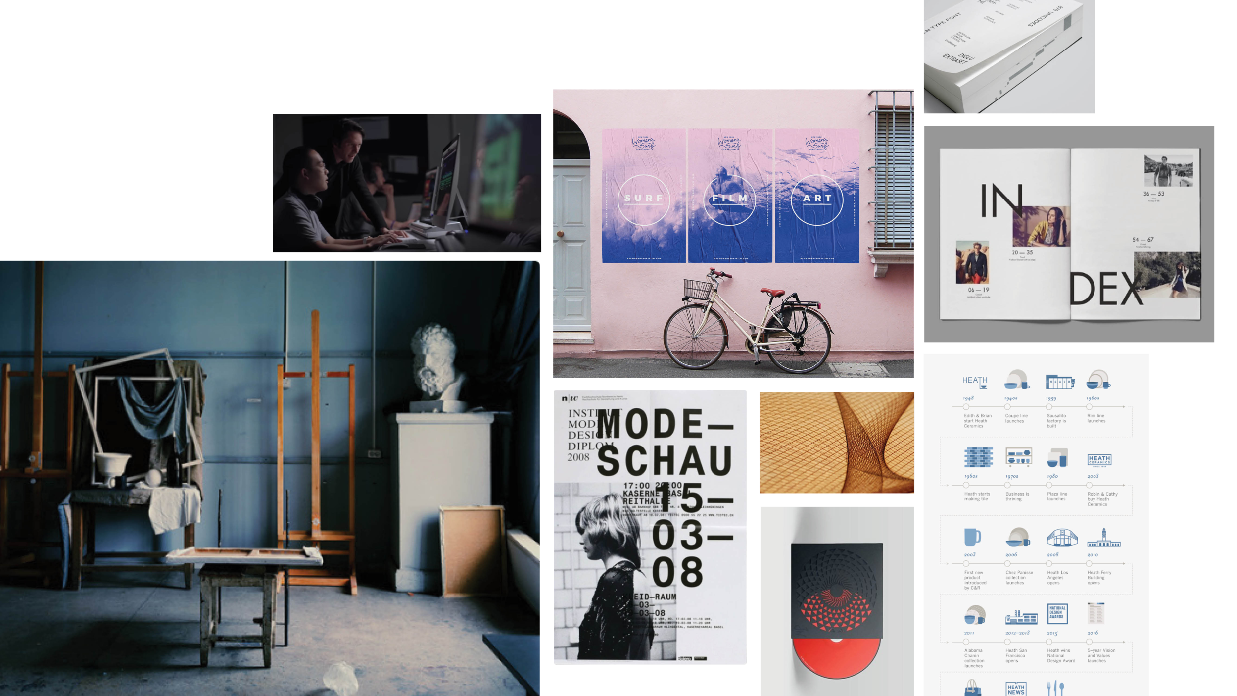
Inspiration for photography and layout

Excerpts from 180 Magazine - inspiration for design elements and aesthetic. Design Director: Kate Nakamura. Editor in Chief: Simon Ungless.
Current Branding:
While having a considerable amount of freedom in regards to aesthetic and design elements, the University’s logo is one of the only elements that will be necessary to incorporate into the new design.

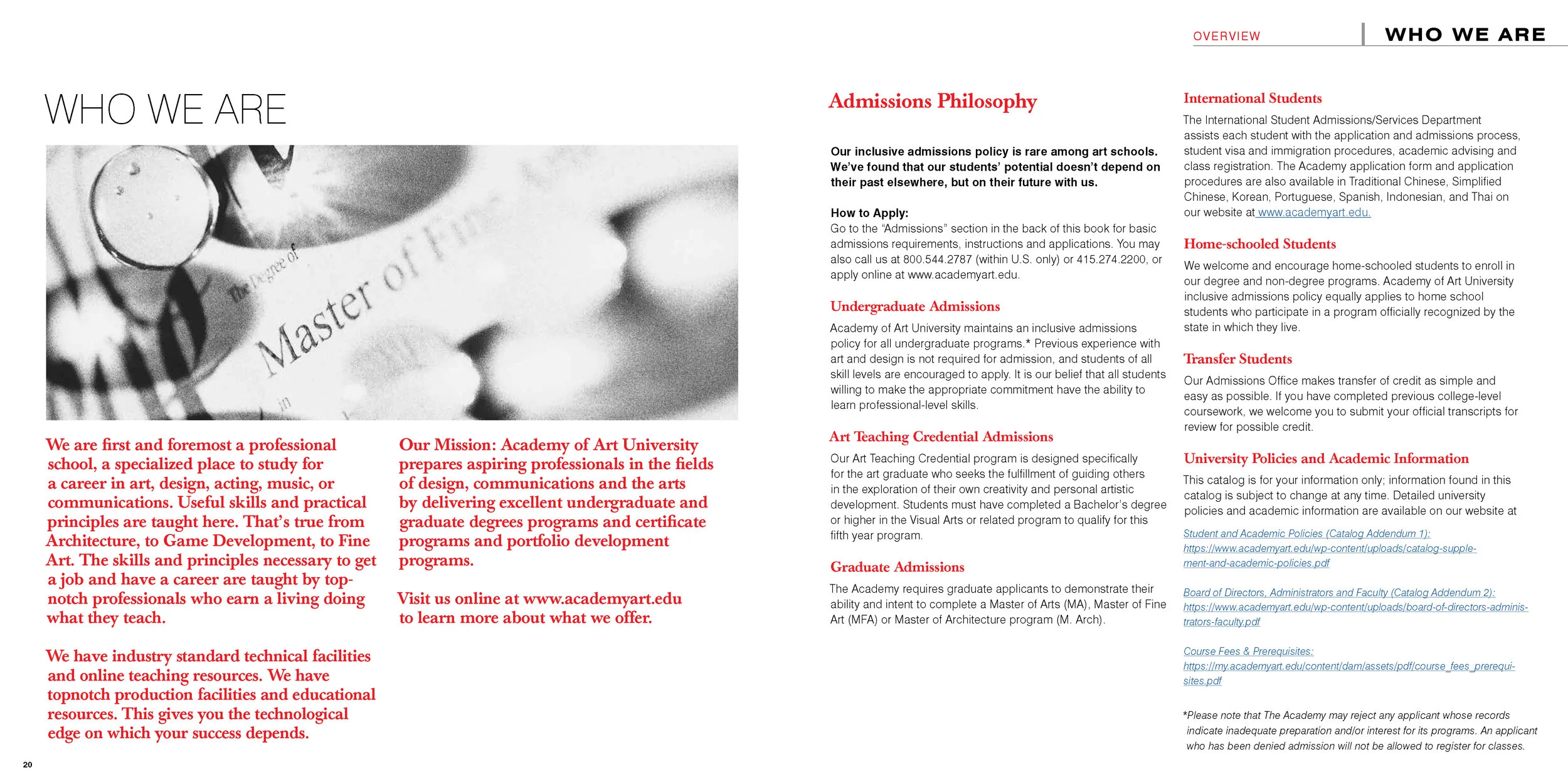
Previous Catalog Design:
(Originally published 2009)


Opportunities:
DESIGN:
Update typography to reflect current design trends.
Improve type hierarchy for information presented for degree requirements and course listings.
Develop visual system to easily identify each of the 22 Schools from the spine of book.
PHOTOGRAPHY:
Implement editorial-based art direction to convey a more professional and polished atmosphere.
Create an environment that readers can envision being a part of - less emphasis on finished student work, and more on students in action and facilities.
Illustration class environmental shot: Art Direction, Kate Nakamura. Photography, Danielle Rueda.
Research - Competitors’ Catalog:

Scans from SCAD’s current prospective student catalog showcasing cleaner, contemporary typography choices, carrying brand colors throughout in order to create a specific type hierarchy and allow readers to easily identify important information. Photography has a professional feel that conveys a contemporary vibe.

Early Ideation
Beginning with trying to find ways to inject some color into the book design, while also creating some way to visually mark sections from the spine of the book, I ended up playing around with some color elements within the gutter of the book.
Typographically, I tried to capitalize on a clean, bold look that would be complementary to a variety of visuals.
I started to start working out what sort of photography would work for this project - I wanted to transport the readers into a space that they could imagine being a part of, similar to this workspace and cutting mat I shot on my phone while working on prototypes.


Leaning towards cleaner sans serif fonts, I tried to incorporate the University’s logo color in elements on the pages listing Degree Requirements for each major. However, some elements like the red lines separating the headers from the content became challenging since it was also important that there not be too many elements that would not be able to be managed with GREP formatting.


While testing out elements for the course description pages, I found that specific aspects of the formatting would not allow for very many courses to be listed per page. While loving the idea of large typography for each school, I was also concerned with the amount of page it would occupy when multiplied by the number of schools, which eventually led to exploring layouts and formatting that would allow for more courses listed per page as well as less space per title.


I started to explore designating a color to each of the 20 schools within the university to aid in wayfinding while readers peruse the catalog, trying out different type treatments and the potential to combine the introductory information for each school with the course listings.


Trying to find ways to take advantage of the 70+ photoshoots that have been completed for the project, I began exploring ways to incorporate imagery as well as color to the Course Description and Degree Requirement pages. GREP styles were implemented in order to make the course header styles automatically apply, saving an immense amount of time.


Final Design
Opening Spreads for Schools:


Degree Requirements and Course Description spreads:
DEGREE REQUIREMENT SPREADS:
Color sidebars included to divide sections visually while the book is closed.
In order to streamline some of the type styling, GREP styles were used for the Unit Requirement tabs, headings, and sub-heads in the General Education Requirements.
COURSE DESCRIPTION SPREADS:
The out-dated drop shadow box with the CTA to “Apply, Register, and view” is replaced with a new version that has a more contemporary feel, using type hierarchy rather than a bounding box to grab the viewer’s attention.
New document size and type sizing allows for more courses to be listed per column.
Repetition of image elements for each School creates visual consistency.
Cover Ideation:


Art Direction
Working closely with photographer Danielle Rueda, around 70 photo shoots were completed for the University project. Aiming to highlight the multi-faceted nature of the school and what it has to offer led us from places like the USS Hornet, the 2019 Game Developers Conference, to MFA Jewelry studios.
It was a great opportunity to frame images in a way that would naturally lend themselves to be accompanied by text - allowing for additional flexibility when it came to layout options.
On-site: Track and Field practice at City College
On-site: Portraits of Jewelry + Metal Arts MFA Students
On-site: Track and Field practice at City College
On-site: Student Life / Dorms - Since we were not allowed access to student rooms, this desk scene was staged in one of the common areas of a dorm building in order to emulate actual living spaces.
On-site: Woodworking tools staged in the Architecture Workshop
In Studio: Featuring a project from the Footwear and Accessories department in the School of Fashion
In Studio: Drawing tools laydown
In Studio: To showcase collaboration between the School of Acting and the Costume Design department, images shot from a dress rehearsal were printed out and used in laydown compositions with the actual costumes worn by the actors
In Studio: Athletics
Art direction for all images – Kate Nakamura. All photography by Danielle Rueda.